-

- Astronics Proposed Ad Layout
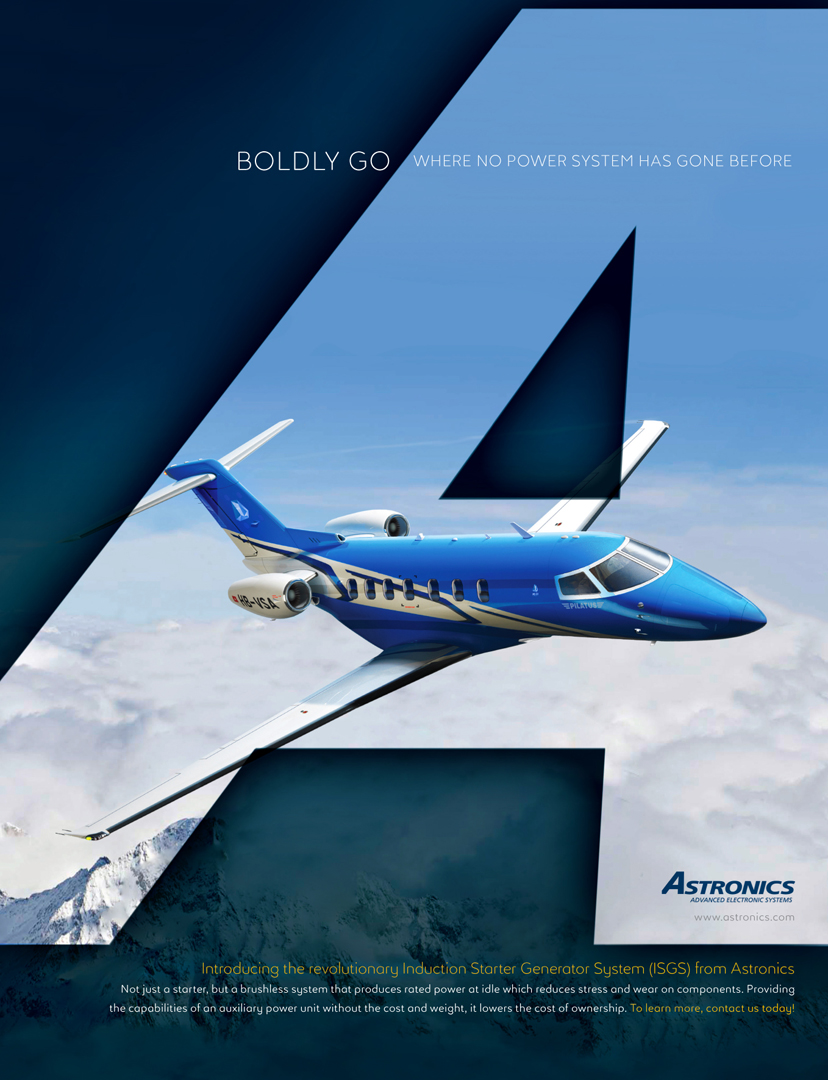
This ad layout was proposed during a refresh phase. In addition to suggesting new, trendier fonts, I wanted a bolder visual for stopping power in publications while reinforcing brand recognition as they enjoyed significant expertise in the industry already. As such the logo was not going to change, so I played up the A shape to add a bit of spunk to the aircraft-in-flight beauty shot. Ads in the aviation/avionics industry, understandably so, tend toward the safe, tried and true side of the spectrum, so working in layouts that are less expected is always an enjoyable exploration.

Most Commented Posts